Introduction
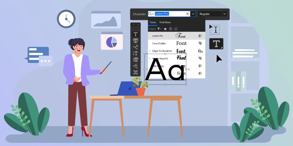
In the evolving world of business communication and digital marketing, the visual presentation of ideas holds as much power as the content itself. Fonts are no longer a secondary consideration in presentation design. They are now recognized as powerful tools to influence perception, communicate emotion, and shape brand identity. As companies compete for attention in an increasingly visual marketplace, presentation font trends are shifting toward styles that combine clarity with character.
Businesses, marketers, and website owners aiming to boost engagement and elevate their storytelling through design must pay attention to the changing landscape of typography. This article explores the emerging presentation font trends, how they influence visual appeal, and why they matter more than ever in modern branding and marketing.
Why Fonts Matter in Presentations
Fonts do more than convey words. They set the tone for your entire presentation. Whether delivering a pitch deck, a product demo, or an internal training module, the typography you choose communicates professionalism, personality, and clarity. A modern, clean font can make content appear trustworthy and fresh. A serif font might evoke tradition or elegance, while bold, geometric sans-serifs can project innovation and confidence.
With virtual meetings, webinars, and screen-based content now dominating corporate communication, the importance of font readability and on-screen visual impact has significantly increased. Understanding current presentation font trends helps businesses create presentations that not only look contemporary but also connect with audiences more effectively.
Minimalist Fonts Are Leading the Way
Minimalism continues to influence font choices in modern presentation design. Clean and straightforward sans-serif fonts like Montserrat, Lato, and Open Sans are widely used for their versatility and readability. These fonts reduce visual clutter and allow the core message to shine. The minimalist trend is grounded in the idea that less is more and reflects a desire for clarity in an information-heavy world.
Minimalist fonts also support a sleek and polished aesthetic. They are often chosen by tech companies, startups, and creative agencies aiming to appear modern and forward-thinking. The lack of decorative elements in minimalist fonts ensures that the presentation content remains accessible and easily digestible on all screen sizes and devices.
Serif Fonts Are Making a Comeback
Once considered too traditional or formal for digital screens, serif fonts are now enjoying a resurgence. With better screen resolutions and responsive design, serif fonts like Georgia, Merriweather, and Playfair Display are being reintroduced in modern presentations to convey sophistication and credibility.
This return of serif fonts reflects a broader trend of blending the old with the new. Brands that want to appear established and trustworthy without losing touch with contemporary design aesthetics are leveraging this font style. Serif fonts are particularly popular in finance, law, and education sectors where heritage and authority matter. The modern twist comes in pairing serif fonts for headings with simple sans-serif fonts for body text to create balance and harmony.
Custom and Handwritten Fonts Add Personality
Custom fonts and handwritten styles are being increasingly adopted to bring personality and uniqueness to presentation design. These fonts can help distinguish a brand and make presentations more memorable. When used thoughtfully, they break the monotony and humanize content in a way that standard fonts cannot.
However, custom fonts require careful handling. Overuse or poor integration with the overall layout can compromise readability. These fonts work best for titles, callouts, or section headers rather than body text. Their purpose is to enhance brand identity or storytelling, especially in creative and lifestyle industries where emotional engagement is key.
Variable Fonts for Responsive Design
The rise of responsive design and cross-platform content sharing has led to the adoption of variable fonts in presentation design. These fonts are dynamic and allow designers to adjust weight, width, and other characteristics without switching fonts entirely. This flexibility ensures optimal readability and visual consistency across different screen sizes.
Variable fonts are part of a broader shift toward more dynamic, tech-enabled presentation solutions. They support customization without clutter, offering a practical solution for businesses seeking design consistency while maintaining creative freedom. Their scalability and performance benefits also make them ideal for web-based presentations and embedded digital decks.
Bold Typography Is Driving Attention
In an age of shortened attention spans, bold typography has become a visual strategy to capture interest instantly. Oversized headlines, strong typographic contrast, and creative font stacking are emerging tactics in presentation font trends. Bold fonts such as Bebas Neue, Oswald, and Anton are often used to emphasize key messages and section transitions.
Bold typography is not just about size but also about placement and hierarchy. It guides the viewer’s eye and ensures that essential messages are not overlooked. This trend is especially popular in marketing decks, pitch presentations, and event slides where first impressions and impact matter most.
Typography With Motion and Animation
Fonts are no longer static elements in a presentation. With advancements in software and motion design, animated typography is becoming a popular trend. Subtle text animations, kinetic typography, and transitions that move with purpose can enhance audience engagement and retention.
This trend is highly effective when used in moderation. Motion adds life to text and helps emphasize specific ideas or create a narrative rhythm. Marketers and digital strategists use animated fonts to create immersive storytelling experiences in webinars and product demos.
Fonts and Brand Consistency
Modern font trends also emphasize the importance of brand consistency. Companies are moving toward curated font systems that align with their visual identity. Rather than using default fonts, organizations now integrate custom font libraries across their digital assets, including presentations. This consistency strengthens brand recognition and builds trust with audiences.
Typography is one of the most identifiable elements of a brand’s visual language. When presentation fonts align with website typography, packaging, and print materials, the result is a unified and professional appearance that reinforces brand positioning.
Inclusive and Accessible Fonts
Another crucial trend shaping presentation font choices is accessibility. Fonts need to be legible for all viewers, including those with visual impairments or reading difficulties. As awareness of inclusive design grows, businesses are selecting fonts designed for maximum readability.
Fonts like Atkinson Hyperlegible and Tahoma are being chosen for their accessibility features. High contrast, generous spacing, and simplified letterforms contribute to an inclusive presentation experience. This trend reflects a growing commitment to diversity and user-centric design.
Color and Typography Pairings
Font trends are also being influenced by color psychology and design harmony. Designers are now pairing typography with colors that reflect mood, brand essence, or message tone. This holistic approach ensures that fonts are not isolated choices but work in tandem with background colors, visuals, and overall design themes.
Whether using calming pastels with soft fonts for wellness presentations or bold colors with geometric fonts for tech events, the combination of font style and color can elevate the impact of a presentation. The trend is about emotional resonance as much as it is about visual structure.
Measuring the Impact of Font Trends on Presentation Success
To understand whether font trends are positively impacting presentations, businesses can monitor a few key metrics. Engagement levels during live presentations, audience feedback, time spent on slides, and conversion rates from embedded decks all serve as indicators of visual effectiveness.
A consistent brand experience across platforms, including presentations, contributes to greater trust and loyalty. When typography supports readability and emotional connection, audiences are more likely to absorb information and take desired actions. High-quality presentation design that leverages current font trends also increases the likelihood of content being shared, bookmarked, or linked to online.
Marketers can also use A B testing for presentation slides to analyze which font combinations perform better in terms of clarity, visual appeal, and retention. This data-driven approach ensures that typography decisions are aligned with business outcomes.
Conclusion
The evolving presentation font trends reflect a broader transformation in how businesses approach visual communication. From minimalist fonts that emphasize clarity to bold typography that captures attention, the role of typography has expanded beyond basic readability. Font choices now influence branding, user experience, and content performance.
For businesses, marketers, and website owners aiming to stand out in a saturated digital environment, keeping pace with these font trends is no longer optional. It is essential for crafting presentations that resonate with modern audiences and communicate value effectively.
By embracing fonts that align with brand identity, support accessibility, and enhance visual storytelling, professionals can ensure their presentations leave a lasting impression. The future of presentation design lies in the thoughtful integration of typography that not only informs but also inspires.
To stay ahead in your visual communication strategy and build high-impact presentations, start evaluating your current typography choices and consider how they align with these emerging trends. The right font can turn a good presentation into a great one and transform passive viewers into engaged participants.