Contract for Difference (CFD) lets you take advantage of both rising and falling markets forex trading demo account without actually owning the asset. But while the opportunity is vast, the risks are real. Nearly 70% of retail traders lose money in this fast-paced arena. The key difference between success and failure often comes down to one important skill: knowing how to read and understand price charts.
CFD chart reading forms the foundation of profitable CFD trading strategies by informing timing, risk management, and entry and exit signals. Without this knowledge, traders end up relying on guesswork, causing themselves to face unnecessary losses.
In this guide, we’ll show you how to read CFD charts with precision. If you're serious about trading, understanding charts is essential.
How to Read Candlestick Patterns in CFD Trading?
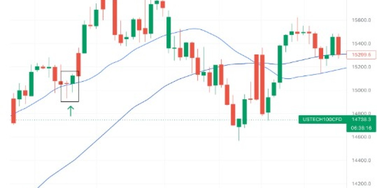
Candlestick charts might seem tricky at first, but they're actually one of the easiest ways to understand price action in demo account in forex CFD trading. Candlestick charts are the backbone of CFD technical analysis.
Body (thick part): Shows the opening and closing prices
Wicks (thin lines): Show the highest and lowest prices during that period
Color (usually green/red): Indicates if the price went up (bullish) or down (bearish)
5 Simple Candlestick Patterns Everyone Should Know
The Doji (Market Indecision)
Looks like: A cross or plus sign (very small body with long wicks)
Meaning: Buyers and sellers are equally matched, which means a trend might reverse soon
The Hammer (Bullish Reversal)
Looks like: A hammer with a short head (body) and long handle (lower wick)
Meaning: After a price drop, buyers are stepping in, making it a good time to consider buying
The Engulfing (Strong Trend Change)
Looks like: A big candle that completely covers the previous small candle
Meaning: The trend is strongly reversing (bullish if green, bearish if red)
The Shooting Star (Bearish Reversal)
Looks like: An upside-down hammer with long upper wick
Meaning: After a price rise, sellers are taking over. So, it might be time to sell
The Morning Star (Early Bullish Signal)
Looks like: Three candles - a long red one, a small middle one, and a long green one
Meaning: Like a sunrise after darkness, it signals the end of a downtrend
Pro Tip: These patterns work best when they show up after strong trends and close to key support/resistance levels. Always check with other indicators before jumping into trades.
Understanding Support, Resistance, and Trendline Analysis
Identifying support level and resistance level zones helps define entry and exit signals and manage risk effectively.
Support Level: This is the price point where things stop dropping (buyers jump in), usually at previous lows.
Resistance Level: This is the price point where things have a hard time going up (sellers take over), usually at past highs.
Trendline Analysis involves connecting rising lows (for uptrends) or falling highs (for downtrends), which can help with CFD chart strategies.
Trendlines serve as dynamic support/resistance to help set stop-losses or profit targets.
Conclusion:
Practice, Patience & Continuous Learning
Building a strong chart-based trading strategy requires patience and practice. Before you risk real money, hone your skills using demo accounts to test things out. This builds confidence while helping you implement effective risk management strategies for traders.